Sweetpea Q&A with DP Nick Morris & Colorist Toby Tomkins
We sat down with Cinematographer Nick Morris and Harbor Senior Colorist Toby Tomkins to discuss the unique visual aesthetic of Sweetpea. Read on to learn how they developed a look in step with the dark and comedic tone of the Sky Original Series.
By: Alli Albion
When did you get involved in the project and what were the initial creative conversations like?
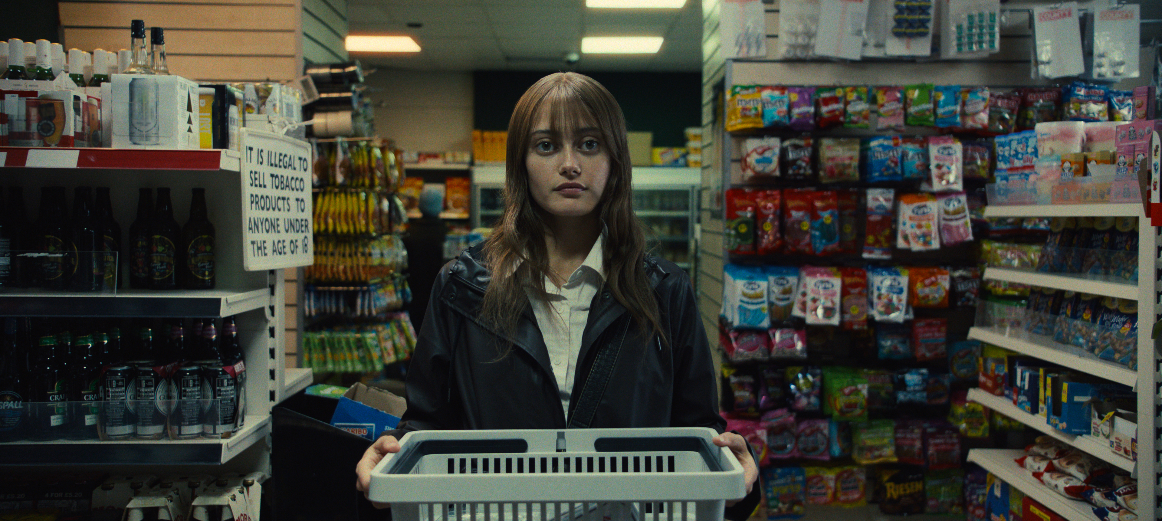
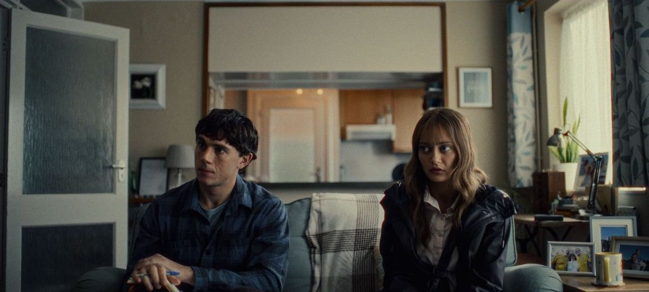
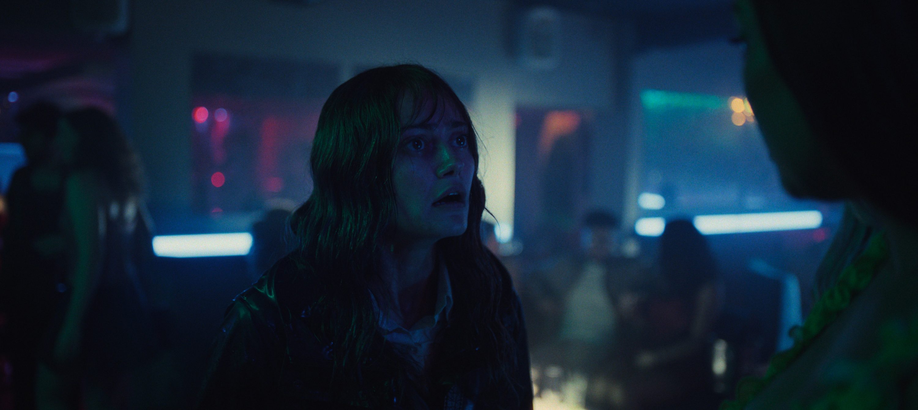
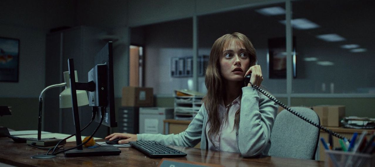
Nick: I got involved with Sweetpea about twelve weeks before principal photography. I had some initial meetings with the team and really loved the scripts. I started chatting with Toby a few weeks into my prep, and then we started doing tests and proper look development about two weeks before the shoot. Ella Jones, the director, had a specific vision to tread a delicate line between comedy and something darker and more sinister. We looked at shows like Fargo and Barry, that managed to remain cinematic while maintaining a distinct and off-kilter tone. We also studied the Coen brothers' films, particularly Burn After Reading for its approach to framing and lighting. I simultaneously went down a particularly deep rabbit hole of early Fincher movies like Fight Club, The Social Network and Panic Room, but primarily Se7en. I loved the acidic undertone to the lighting in many of those films, and the dinginess that they manage to get across in fluorescents. In Se7en, I was inspired by their use of Rain FX to make everything look wet. From that jumping off point, we developed a look that featured a lot of green in the lighting and built subtle color contrast around that.
How did you go about setting the look?
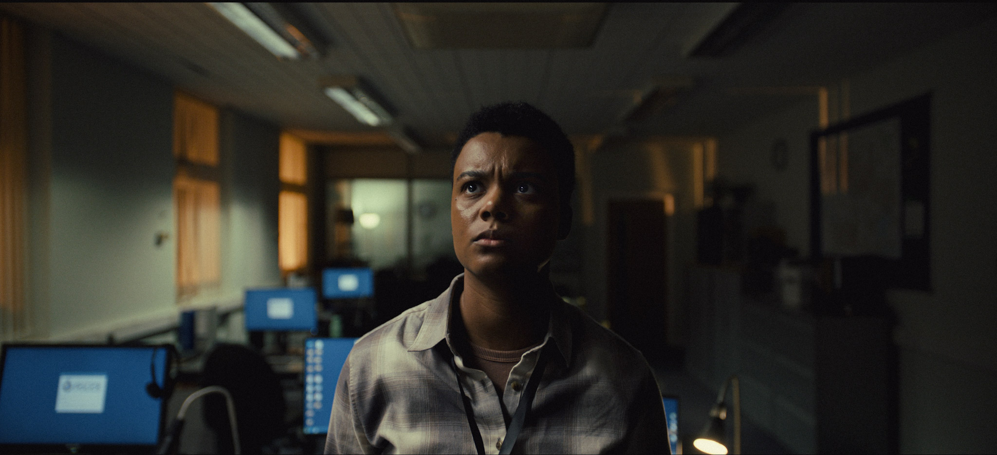
Nick: When it came to the look development, we were aligned behind using film emulation to echo that era of '90s and '00s films we love - the photochemical Fincher and Coen Brothers years - and we looked at various textural options with grain, halation, and sharpening that added some grit. In terms of color, red became an important hue to the themes of the show. We spent a while pinning the exactness of the print-inspired dense red and finding ways to bring skin tones through the overall green-ness to the lighting. We spent a day shooting screen tests with Ella Purnell on the nearly finished stages, trying a broad a range of lighting worlds, and then we brought those into the suite with Toby. Building a show LUT was hard work because it needed to be adventurous enough to be worth the effort, but safe enough to work across every possible lighting environment. Toby did an amazing job of fiddling with the color science to manipulate the hues into something that felt reminiscent of a traditional film print process, while also allowing us to tweak the most important tones of the production design and costume. We also prioritized a feeling of density in the image to keep a sinister edge.
Toby: We started look development a couple weeks before the shoot with some test material from the office scene and a few other bits. Nick had plenty of visual references, so it was great to chat through what he liked in each of them and then I combined them all into a look we developed and refined from there. I think the strength of this grade is its bold but authentic feel. Once you're in the world, you just believe it, but it doesn't feel too real. There's an off kilter feeling that compliments both the macabre and the comedy.
Are there any technical aspects that stood out? Did you use a new tool/camera/lens or a noteworthy technique to achieve the desired look?
Nick: This was my first show on the Alexa 35. We tested a wide range of cameras, and the Alexa really stood out. All the color data made for rich images, and the extra latitude made my life on set much easier. Toby also promoted a general approach of over-exposing for a very thick camera negative, so we shot at relatively low ISOs for what the camera can do. We'd normally aim for a base ISO of 320 or 400 to give the camera an extra stop's worth of color data. I was impressed by what that extra data allowed Toby to do later down the line, in terms of creating rich shadows with a lot of color density.
Toby: This was my third show on Baselight, and I've started to land on a go-to toolset. But with the introduction of new tools in Baselight V6, I've started to change how I approach problem solving in the grade. I'm using new tools like X-grade to speed up changing specific colors in a natural way without having to pull a key which both saves time and keeps things natural.
The first episode is pretty heavy going narrative-wise! How did you use cinematography and color to make those heightened moments of drama and emotion sing? There’s a beautiful roaring red light in the penultimate scene which acts as a perfect metaphor for what takes place next...
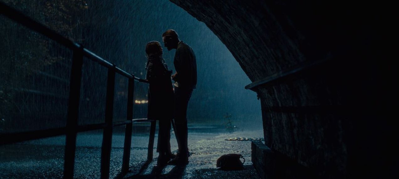
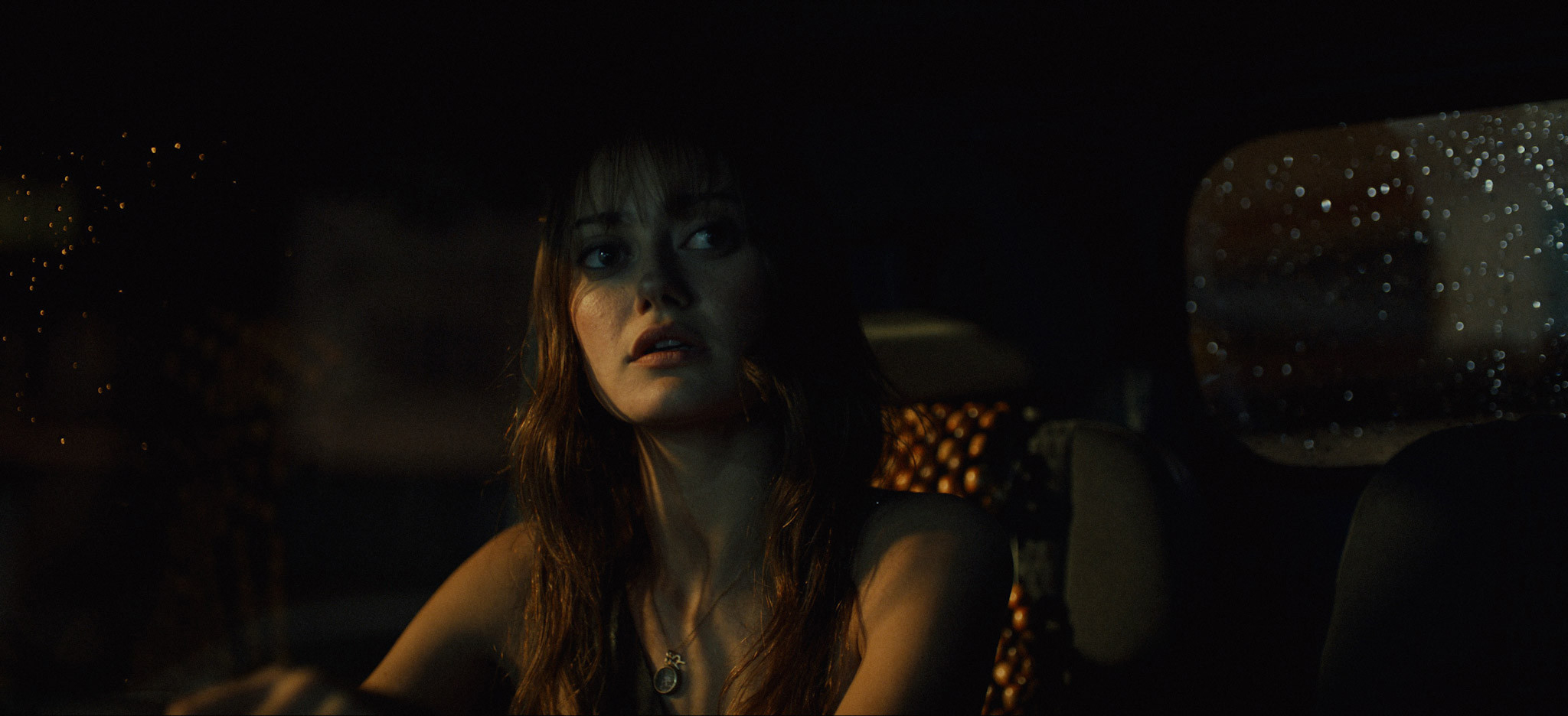
Nick: It is pretty heavy stuff! And certainly, we'd have not been doing our job if we weren't paying attention to how we wanted those key moments to play out. In terms of the red lighting in the scene in the canal, we had an early conversation about foreshadowing and how we might use color to invoke a sense of threat and danger. Generally red was a color that was largely banned from the production design and lighting where possible. We tried to drop in tiny red details like the color of a stapler in the office, or an item of clothing in a wardrobe in the background, but overall, we tried to reserve it for key moments to build as the show progresses. In terms of the arc of episode one, we knew the emotional crescendo would occur in the nightclub just before the canal scene, so we used red there. It also served as a good bridge without flashbacks. We designed the club logo to be red, to allow it to have a red neon sign outside and picked our canal location so that the club exit could be just in shot to motivate more red lingering across that scene. The canal was also where lots of my Se7en inspired Fincher dreams of pouring torrential rain came true, and so it was fun to get to put that together, although working on an actual canal is a nightmare so I'm glad that’s behind us!
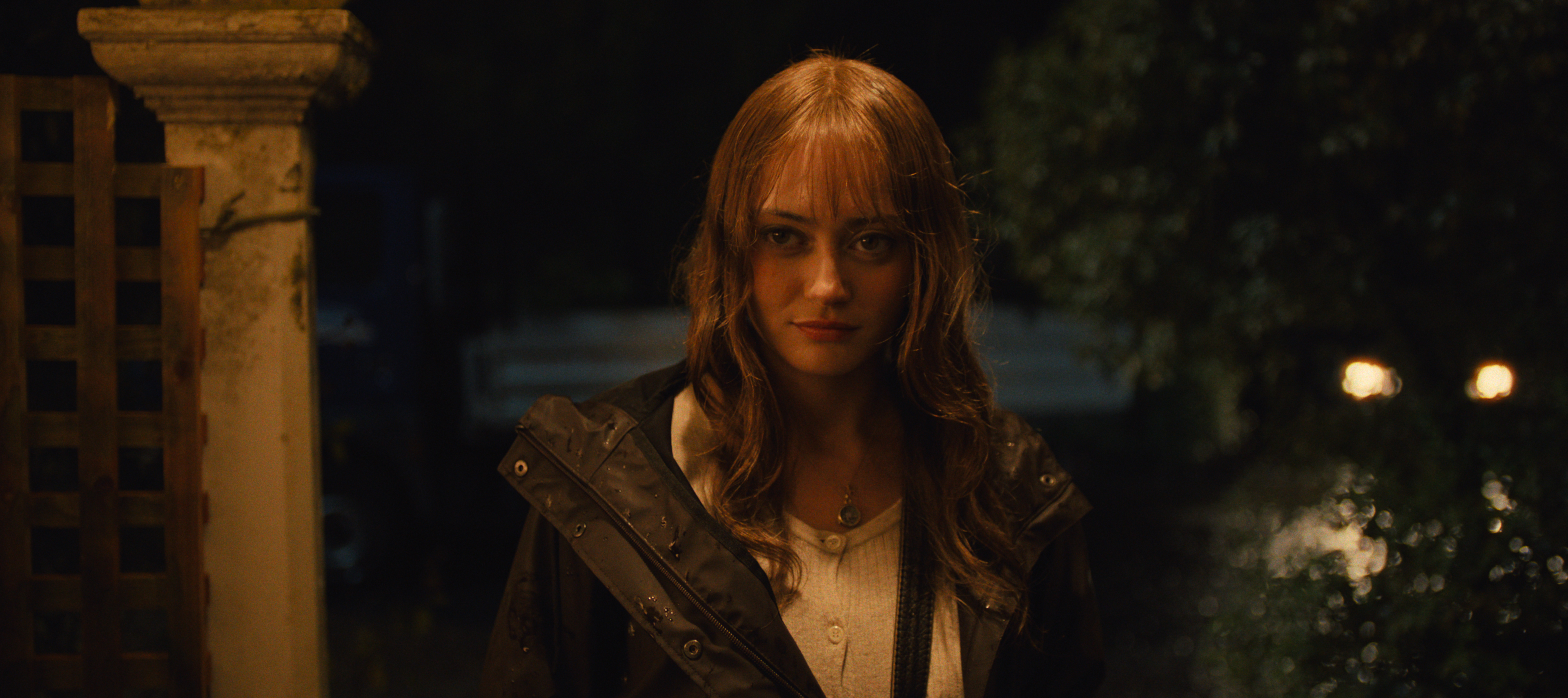
Ella Purnell stars as Rhiannon, a quiet wallflower who develops a vengeful and intoxicatingly liberating taste for murder. Rhiannon Lewis doesn’t make much of an impression – people walk past her in the street without a second glance. She’s continually overlooked for a promotion at work, the guy she likes won’t commit, and her dad is really, really sick. Then everything in her life turns upside down. Rhiannon is pushed over the edge and loses control. Suddenly the wallflower is gone, and in its place is a young woman capable of anything… Rhiannon’s life transforms as she steps into a new, intoxicating power, but can she keep her killer secret?
Ella Purnell stars as Rhiannon, a quiet wallflower who develops a vengeful and intoxicatingly liberating taste for murder. Rhiannon Lewis doesn’t make much of an impression – people walk past her in the street without a second glance. She’s continually overlooked for a promotion at work, the guy she likes won’t commit, and her dad is really, really sick. Then everything in her life turns upside down. Rhiannon is pushed over the edge and loses control. Suddenly the wallflower is gone, and in its place is a young woman capable of anything… Rhiannon’s life transforms as she steps into a new, intoxicating power, but can she keep her killer secret?
Ella Purnell stars as Rhiannon, a quiet wallflower who develops a vengeful and intoxicatingly liberating taste for murder. Rhiannon Lewis doesn’t make much of an impression – people walk past her in the street without a second glance. She’s continually overlooked for a promotion at work, the guy she likes won’t commit, and her dad is really, really sick. Then everything in her life turns upside down. Rhiannon is pushed over the edge and loses control. Suddenly the wallflower is gone, and in its place is a young woman capable of anything… Rhiannon’s life transforms as she steps into a new, intoxicating power, but can she keep her killer secret?


Ella Purnell stars as Rhiannon, a quiet wallflower who develops a vengeful and intoxicatingly liberating taste for murder. Rhiannon Lewis doesn’t make much of an impression – people walk past her in the street without a second glance. She’s continually overlooked for a promotion at work, the guy she likes won’t commit, and her dad is really, really sick. Then everything in her life turns upside down. Rhiannon is pushed over the edge and loses control. Suddenly the wallflower is gone, and in its place is a young woman capable of anything… Rhiannon’s life transforms as she steps into a new, intoxicating power, but can she keep her killer secret?

Ella Purnell stars as Rhiannon, a quiet wallflower who develops a vengeful and intoxicatingly liberating taste for murder. Rhiannon Lewis doesn’t make much of an impression – people walk past her in the street without a second glance. She’s continually overlooked for a promotion at work, the guy she likes won’t commit, and her dad is really, really sick. Then everything in her life turns upside down. Rhiannon is pushed over the edge and loses control. Suddenly the wallflower is gone, and in its place is a young woman capable of anything… Rhiannon’s life transforms as she steps into a new, intoxicating power, but can she keep her killer secret?

Ella Purnell stars as Rhiannon, a quiet wallflower who develops a vengeful and intoxicatingly liberating taste for murder. Rhiannon Lewis doesn’t make much of an impression – people walk past her in the street without a second glance. She’s continually overlooked for a promotion at work, the guy she likes won’t commit, and her dad is really, really sick. Then everything in her life turns upside down. Rhiannon is pushed over the edge and loses control. Suddenly the wallflower is gone, and in its place is a young woman capable of anything… Rhiannon’s life transforms as she steps into a new, intoxicating power, but can she keep her killer secret?
There are a range of internal and external locations with multiple light sources in each scene - how did you go about setting these up and creating harmony and consistency there?
Nick: My approach to lighting was to be as environmentally motivated as physically possible. I tried to leave most of the work to practicals and only supplement things when needed. This involved a lot of attention in the design and scripting phases and the blocking for the actors, but it really pays dividends when you don’t need a mountain of lighting equipment. We started the shoot on the Gazette office set which was designed to include lots of internal glass partitions. It became clear quite quickly that the multiple reflections would prohibit us from using any lights on the floor. So we had to be dogmatic with our practical lighting approach from the outset. I loved that way of working so much that I became a huge pain to poor Simon the production designer and the set dressers. We’d go over the dressing plans of every location in huge detail to get the right combination of practical fixtures in the right places. Generally, we fitted most practicals with LEDs that we could control from a desk, or an iPad on location, and that helped tie together the mixture of colors and intensities across the series. We also had a selection of hero colors we used nearly everywhere: sodium streetlights were tungsten with chocolate gels, we used 8000k plus 1/4 green for moonlight, and we tended to have a room tone lamp bounced into the ceiling of most locations that was neutral bar far 1/4 green gel, which introduced a subtle greenness throughout.
Were there any particularly memorable challenges on set or in post?
Nick: One of our primary challenges was the vehicle work. Across the show we had countless journeys with dialogue, and it would have meant days and days on low loaders, plus all the material on a moving bus. Being stuck on a low loader is one of my least favorite places to be on a film set, especially when you have a high page count and limited schedule like we did, so all of us were keen to find alternatives. The production team suggested volume filming to me, and I'll admit I was pretty skeptical. I'd seen amazing things on shows like the Mandalorian, but they were using fully tracked and mapped unreal engine worlds, where we would be using background plates as if we were shooting a rear projection process. I've worked with rear projection before, and it has major limitations, especially in terms of a feeling of flatness in the background because everything is six to ten feet away from the lens, rather than hundreds of yards if not miles. Also, I’d seen various LED scenes that seemed to suffer from a kind of smeariness or strange motion blur. I was keen to investigate blue screen instead. In the end, I shot a series of tests on Sony FX3s rigged to Helio’s (our gaffer) van and took them to MARS volume in London to test. With a car parked on the volume, and seeing the nuance of the dynamic lighting and how it reflected in panels and lit faces and bloomed through dirty patches on a window, I was an instant convert. There are always elements that aren't quite as real, so you have to live with a certain flatness to the bokeh on the backdrops, but where possible I had the plates shot with a shallower depth of field to allow for further way things to be softer than closer things. The next challenge was how to shoot the bus in the volume. Thankfully Emma Biggins, the line producer, thought to get a bus in to test on the volume, we didn't really have the money to rent it for extra days, but it paid huge dividends when we realised that the big windows on the bus meant we immediately saw the floor of the studios where the screens finished. The solution that Art Director Philli Mumford ingeniously came up with was to drive the bus on a huge low loader. It lifted the bus up about four feet from the floor and allowed us to be centered in the height of the volume. It was an insanely tight squeeze to get the bus and the huge low loader truck into the studio, but it worked fantastically on the day.
You’ve worked together before on the BAFTA-winning ‘Mood’ for BBC, as well as numerous commercials, how did this established relationship impact/enhance your work/the process on Sweetpea?
Nick: Toby and I are both big nerds, and I think that helps the way we talk to each other. Generally, we can go off the deep end on incredibly nuanced details of an image, but we are also often aligned on the big picture. We have very similar tastes when we think of what looks good, and we can tell you about it in incredibly anal detail! Toby also did the look development on Everything Now, my last show for Netflix, and a lot of the groundwork of our look for Sweetpea started there. We spent a lot of time talking about texture and my preference for using cleaner lenses and cameras that we mess up digitally later. Plus, we're both big Steve Yedlin fans, and I'm certainly inspired by his approach to deep film emulations. The exciting thing, and somewhere Toby certainly excels, is how to work with this style of look in an HDR world and playing with the extended palette of modern screens and cameras. More than anything, I like how Toby approaches grading a show overall. We spent a long time playing with a master look, adding more and more detail to it, to the point that most scenes already looked great before we got to DI, because he’d already worked his magic with the color science. It front loaded a lot of the work but meant that then we could spend more time asking the important questions about feeling and tone on a scene-by-scene basis.
Toby: It was great to work with Nick again and with Ella. Nick has a great understanding of what can be changed in the grade and what can't, so it's reassuring to know I won't be asked to do something that might feel unnatural. It’s always helpful to work with someone you know because there’s already that level of understanding there to build upon.
Sweetpea is available to stream on
NOW in the UK and on Starz in the US
Anything else to add?
Nick: Sweetpea was one of the most enjoyable projects I've had the pleasure of shooting, and getting to see all six episodes through post has been really, really rewarding. I can’t wait for people to see it!
Toby: The hero grade is for HDR, so try and catch it in HDR if you can. The SDR was Dolby Vision derived and although we all love it, it's lacking some of the texture we were able to accomplish in the HDR. I hope people find the look just the right amount of off-kilter!

