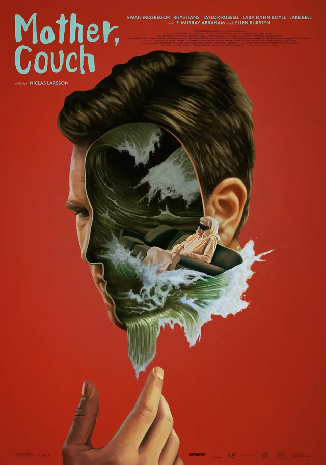
Grade Expectations – Definition Magazine, Toby Tomkins on Great Expectations
Colourist Toby Tomkins talks about the process of creating distinct worlds and working in HDR for the first time for the BBC/Hulu adaptation of Great Expectations
WORDS Nicola Foley
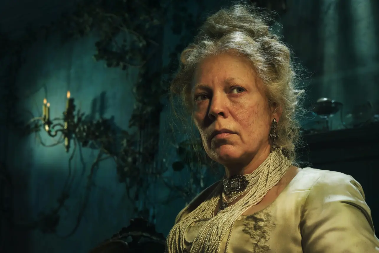
The decaying decadence of Miss Havisham, one of literature’s most canonical characters, provided rich inspiration for the production team behind the recent BBC/Hulu adaptation of Great Expectations. With Olivia Colman in the role of the jilted spinster and Fionn Whitehead playing orphaned Pip, the six-parter takes Dickens’ classic tale down a darker, grittier road – both visually and narratively – into a world of opium dens, sadism, sex and violence.
Helping to bring the series’ noirish feel to life was colourist Toby Tomkins (CHEAT), who became involved during pre-production as the team was gearing up for the shoot. Working in tandem with the DOPs, CHEAT was asked to begin building up the look for the show using screen tests of the actors in costume on location, honing in on a strong aesthetic for the dailies. “I had never worked with [cinematographers] Dan Atherton or Kate Reid before, but it quickly became clear that we had similar sensibilities, and were going to work together well. Once we got into the DI, the magic really started – and we could drive the look forward from the early work in look dev and tailor it to both blocks and their individual subtleties.”
When the team got together for finishing, it became apparent that the original LUT from the dailies would need adapting to portray the story in the way the execs envisaged. Working for the first time in HDR rather than SDR, a decision was made to retain many of the film emulation elements from the original look, “keeping a nice filmic roll-off but adding some additional texture to the highlights with the extended range in HDR,” says Tomkins. “With the extra range in the highlights, we found we could go softer in the midtones while still having ‘bite’ in the image. So we altered the tone curve to get a slightly more painterly tone with a more muted palette throughout.”
An essential element was creating distinct visual languages for each stage of Pip’s rags-to-riches story. “We all wanted unique worlds for Pip throughout his journey, making sure that his country home life felt different to the opium-hazed bowels of Miss Havisham’s house, and the cold streets of London,” shares Tomkins. “Once we dialled in these different looks, it became about enhancing each scene and making sure we were being faithful and naturalistic, but pushing these differences further depending on the tone of the scene.”
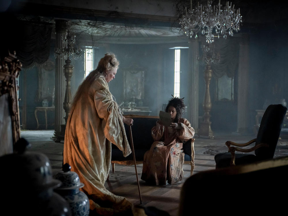
One of the biggest challenges was striking the right balance in Miss Havisham’s world: “The green, hazy tint and the texture of the look was hard to find without washing out the skin tones too much,” explains Tomkins. “When there was firelight or candles in the scene, we found this created an absolutely lovely balance with green tones mixing with yellow, chartreuse and hints of red in the skin tone or lips, holding onto some life in the characters.”
Transitioning seamlessly between worlds presented another challenge. Stepping from the green-tinted domain of Miss Havisham to London’s cyan and cool shadows sometimes felt jarring in the cut, so the team had to find a way to make it work thematically – or smooth it out, particularly if the jump in skin tone was too abrupt.
One aspect of which Tomkins was most proud was a scene set aboard a ship in the first episode. “Most of it was illuminated by a lantern or firelight, with just a hint of cool dusk as fill. It was fun to let the lantern and fire have a more realistic relationship with the rest of the image and keep some colour in the flames or lantern,” he explains. “I’m always a fan of that colour separation along the temperature axis, so when we found that balance it was fun to see it come together.”
Tomkins credits the speed of DaVinci Resolve with helping the whole process run efficiently. “The real-time performance of DaVinci is second to none, and with correctly paired hardware and data IO solutions, it allows me to be liberal with my approach, freely throwing whatever is needed at a shot without worrying about waiting for caching,” he enthuses. “The scene-referred HDR palette also let me make photometric changes quickly to help matching in a natural photographic way. The texture and spatial tools are fantastic, and fast!”
When it came to review, most of it was attended rather than remote, with the execs letting Tomkins and co develop the look across the first few episodes on key scenes at the start of the DI, before iterating based on feedback.
“We were then left to grade each episode and had final reviews on the last day with any changes made at the end,” he recalls. “The iterative process of having a strong dailies look (thanks to the screen tests!), having an initial day to set the look across a few episodes and then the final grade meant we were only ever improving on what came before, so the usual back and forth was reduced. It was a very rewarding experience working with such great collaborators.”
The grade was finished at Harbor Picture Company in London on DaVinci Resolve Studio by colourist Toby Tomkins. Harbor Picture Company’s Richard Ellis onlined the series.
This article appears in the October 2023 issue of Definition. Read the full magazine here.